I’m house hunting again. Because I love houses probably more than most people, I’m glued to the online listings throughout the entire day. We’re in a market where good houses are selling within 24 hours and the bad ones are just sitting. I have great taste in houses – trust me on this – I do. That means if I love a house so will anyone with half a brain and it will sell quickly. I’m also extremely (let me emphasize that again), EXTREMELY judgmental when it comes to home design.
Because I’m constantly looking at listings AND I work in the architectural profession AND I love residential design in general, I’m pretty tapped into all the current trends. So I’d like to say this…
STOP WITH THE FREAKIN’ GRAY ALREADY!!
I wished there was a way I could scream that louder to everyone in the world. I’m to a point where if the first photo shows the formulaic white and gray kitchen or gray pattern tiles in the bathroom or that standard gray paint color, I close the listing and move on. I don’t want a house that looks like every other house in every other city. I’ve never bought or worn a pair of skinny jeans either. A trend usually doesn’t really consider the individual house, age, style or location. It’s like putting the same shade of lipstick on every single person. Sure, it’ll look wonderful on a few, but really, really bad on others. Get the picture I’m trying to paint here? (And for the record, skinny jeans on me are a really bad idea. I prefer to NOT look like an ice cream cone.)
I look at older houses. Usually because they have more character, they actually have rooms instead of one big open space, there’s not a garage taking up the front of the house, they have large trees and we want to be in a particular part of town that only has older houses. It absolutely breaks my heart when I see a vintage house that’s been “updated” (aka destroyed) with a current trend. Trends placed in vintage houses take away the overall composite of the design. Yes, there are some instances where a good update has helped, but too many people out there look at a trendy magazine or current HGTV show and think that’s what they need to do and instead alienate a whole bunch of buyers with their thoughtlessness or put a lot of money into something that just doesn’t quite feel right and they don’t understand why. In order to renovate a house, one must first understand the bones of the house and the style that was first attributed to it.
Think of it like this. Imagine Audrey Hepburn in 1960. Think about her style, that classic Breakfast at Tiffany’s dress or her signature petal pushers and ballet flats. Now, keep her hairstyle the same, her makeup the same, her physique and personality the same but imagine her now in a bandage dress and platform heels. Doesn’t work does it? It just makes a very classy woman look really, really tacky. The same goes for houses.
So, let’s recognize trends in house building and décor and while it may apply to some houses, let’s stop applying it to all. AND can we please know when enough is enough? I’ve grabbed photos and links from realtor.com. They are current listings from multiple cities within the middle of the country to help illustrate my point. All photos are used for the purpose of commentary and links to the actual listings have been created. I would not want to live in any of these houses for many reasons, one being the annoying formulaic white and gray kitchens. However, perhaps one of these could be your dream house. If so, then buy and enjoy. What is clear is that this is a national trend and is over applied to houses all over the country. I’ve tried to find some new and older houses to illustrate that age doesn’t seem to stop the thoughtlessness of some people who are blindly applying the same color and pattern trend to any house.
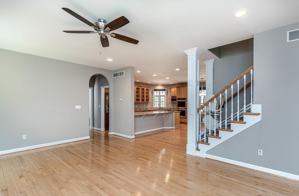
Let’s start with this first house where there is a mild form of the gray trend. In this particular house in Columbia, MO, thankfully the wood floors and wood kitchen cabinets were left wood colored. Wood within a house can positively affect the inhabitants by providing a type of connection with our natural environment. Our brains register wood with trees and nature and can ground or calm us while inside. But someone grabbed the can of gray paint that is a large part of this trend and went to town painting every wall gray. The trim is white, which seems to go hand-in-hand with the trendy gray color scheme, but in this instance, I’m guessing the trim may have always been white. So I’m giving it a pass.
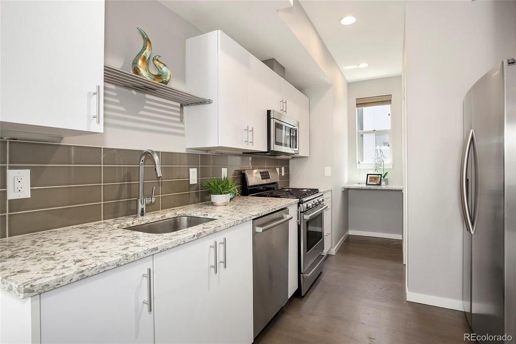
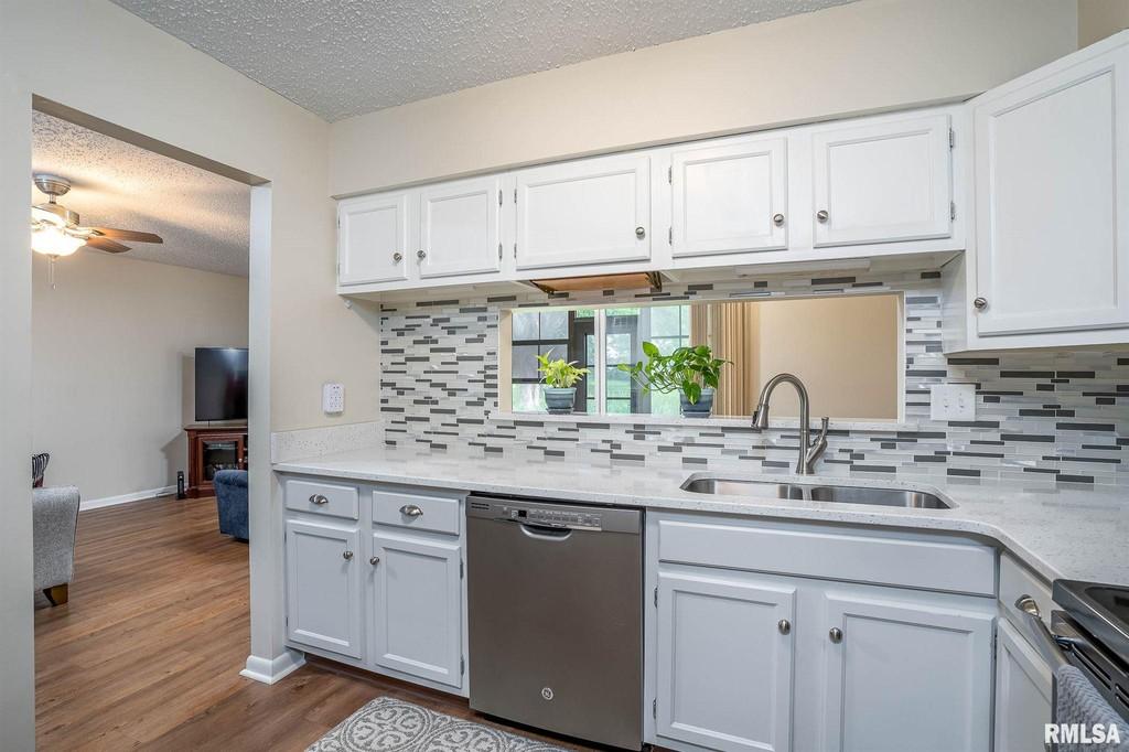
Next, we’ll jump to newer construction in Denver, CO. This is a perfect example of the gray and white kitchen trend in a smaller kitchen. Note that within this trend, all appliances are stainless steel, which is just another form of gray. One plant has been placed on this counter for marketing purposes to provide some type of connection with our natural world among the rather unnatural color palate. Something to note on this kitchen is that it has a tile backsplash in another color and texture of gray. I’ve noticed that tile in a gray pattern of some type seems to be part of this trend’s checklist. This is true for kitchens and bathrooms. The floor in this photo appears to be wood, but also appears to have a gray finish or undertone to it. The whole effect is a type of homogenized gray-ness.
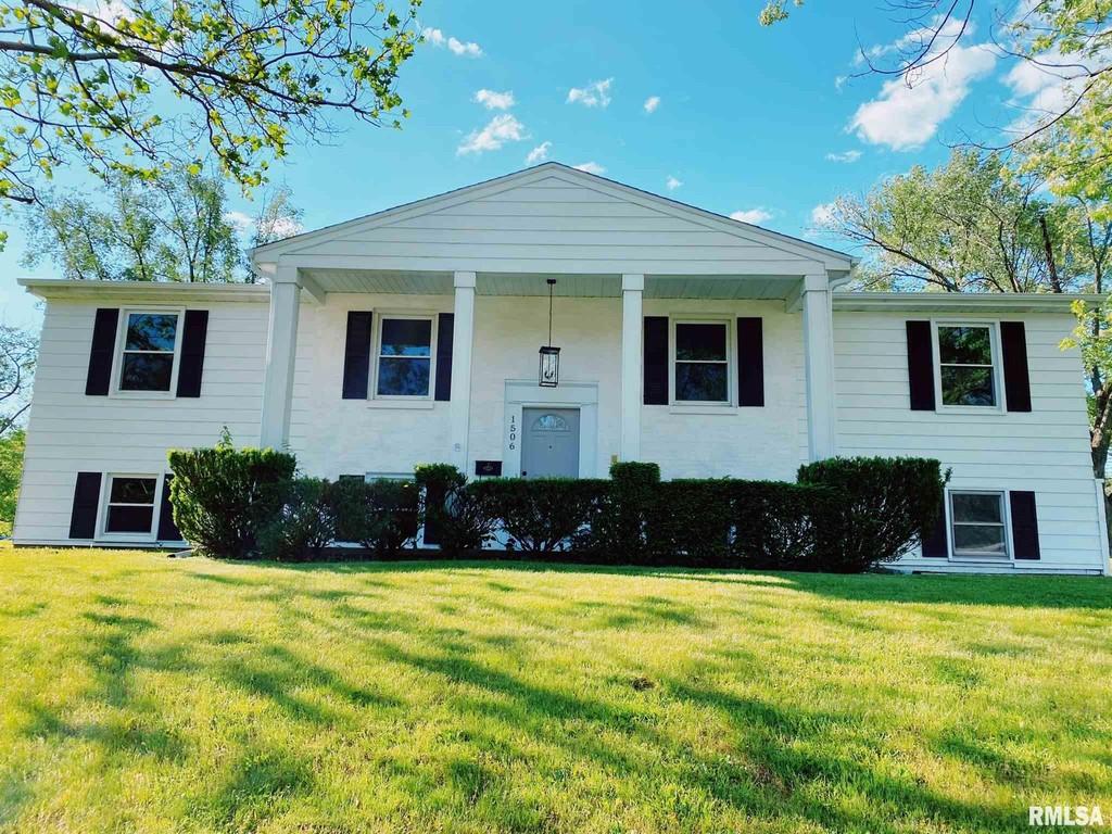
This next example, from Peoria, IL starts with the gray overload right from the outset – as in outside. Someone has painted the front door gray which is a sign of what’s to come once inside. This particular house makes me sad as the listing said it was built in 1965. This house was clearly “flipped” and I’m saddened by the classic wood interior and potential colorful bathrooms that were likely trashed in the process. We should stop trying to neutralize everything in our lives. Living in a house that has the same personality as everyone else’s is a type of conformity if I may offer my opinion. Since I paid for this site, I guess I’ll offer that opinion! Let’s buck conformity and have a little personality and stand out from the crowd!
I found this next example in Davenport, IA. It’s different in that it’s listed as a condo and not a single family home. Just one more illustrations as to how this trend is applied across the board. The exterior of this condo building also has a faux tudor style. Tudor houses tend to have a lot of wood interiors, and in my opinion, when well crafted, are wonderful. This particular condo has eliminated that and gone trendy. Note again, the gray patterned tile. I will give credit on this part though, the walls are more of a vanilla color instead of one of the standard gray paints I’m seeing over and over again. It helps brighten up the gray in general and prevent it from being overly suffocating.
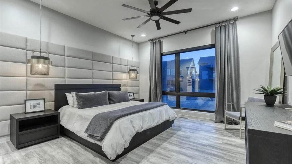
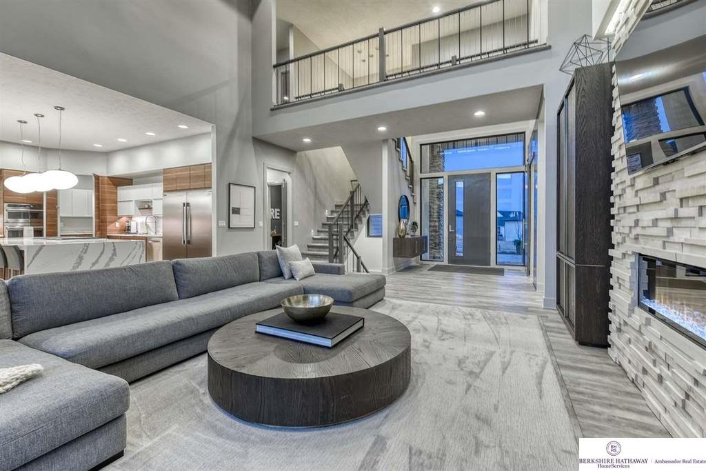
And finally, I must award the grayest house in the world prize to this very large, million dollar house in Omaha, NE. I have always said, if you’re going to go with something, go all in. This “designer” did just that. I don’t think I’ll ever see another house so gray. Gray floors, gray carpets, gray paint, gray window shades, gray sofas, gray blankets, gray furniture, gray ceiling fans (yes – they weren’t even spared), gray barstools, gray bathroom cabinets, gray bar counter, gray baby crib. Even the pool table wasn’t spared as it sports a gray felt top as well. It is surprising then that most of the main kitchen cabinets are a wood color, but note that sections of the uppers are white. It seems that the typical gray and white trend wasn’t completely avoided. All I know is that this is too much gray. Sure, paint would take care of a lot of this issue, along with different furniture than what is being used to stage it with, but some of those elements are fairly permanent (casework) or rather pricey to change out (window coverings aren’t cheap!).
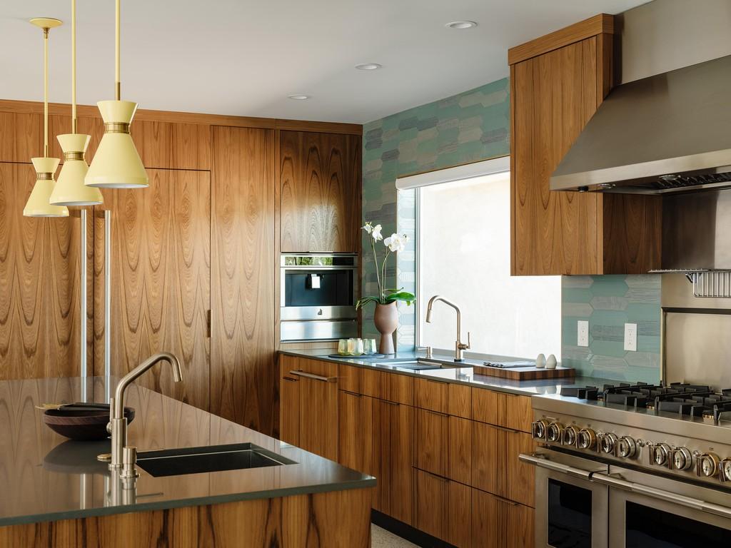
To end this post on a more positive point, I found an architectural stunner located in Palm Springs, CA for sale. Yes, it’s at a price of over $3 million. I certainly couldn’t afford that and a very high percentage of the general population couldn’t either. However, instead of just marking that up to a rich person’s home, I wanted to use it to illustrate a point. These elements can be applied at pretty much any price point of a house.
I looked up the address and found the previous listing for this house which appears to be from summer 2019. It appears that someone had previously purchased the property and gutted it and stripped it down to nothing more than a shell. Who knows what vintage elements were removed in that process. The current owner clearly had a big renovation project on their hands. This is an old shell that’s nearly brand new in every other way. Check out the previous listing here: https://www.pshomes.com/listings/palm-springs/neighborhood/little-tuscany/574-mariscal-road-219016965da/
With the renovation, the owner bucked the gray and white trim and chose warm wood elements instead. There are beige stone and brick elements which are reminiscent of the exterior desert setting of Palm Springs and there are touches of teal in the front door, kitchen backsplash and decorations which bring in the color of water. In a desert environment, it’s nice to find a way to connect to water. Yes, it also has some gray furniture like the previous houses I’ve shown but it also has some yellow furniture, pillows and artwork to offset that grayness. There are elements of dark blue that coordinate with the teal and provide further thoughts of water without it being the matchy-matchy of one color only. I would also like to point out that white, beige and gray aren’t the only neutral colors. If one were to visually remove the furniture and art from these photos, the leftover wall coverings, cabinets, fixtures and paint colors would all be relatively neutral, but with undertones of a color which prevent the drabness that a full-on gray palate provides.
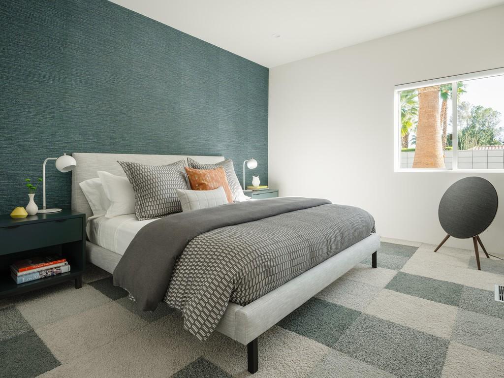
In particular is this image of a bedroom with a neutral teal-colored wall covering acting as an accent on one wall. The other walls are white and the other photos in the listing reveal that there is a large walk-out patio door/window across from the bed which provides plenty of daylight. Yes, there’s a gray bed and a gray patterned carpet. Gray as a color isn’t evil, only when over-applied in willy-nilly fashion. There is a character in this room that is subtle, elegant and yet not boring. The soft color of that wall covering allows it to fall more into a neutral palate than something that’s overly vibrant and overpowering.
To end, I’d like to offer up this plea. Please research house design carefully if you might be thinking of renovating. Please be aware if something is being repeated over and over again across various mediums and ask yourself if this appears to be a trend. If that answer is yes, then ask yourself if the bones of your house are right for that trend. Maybe it will fit well, but maybe it’s intended for a different styled house completely.
At this moment, I just want to beg the world to leave this gray trend behind.
